

I used colour in my images many years ago to represent digits. What has changed over time is my palette for representing digits. The more colours I put on the palette, the more two colours or shades will look similar - and that is undesirable. There are three shades of brown in the palette picture below - and they are quite close to each other in tint!

By having this idea that a colour can indicate a digit (or represent a letter of the alphabet), it opens up the possibility of memorising information by remembering the colours of a picture.
I have used this feature in many of the images which I make. The colour of someone's hat or clothing top or trousers or hair can all mean something: digits or perhaps letters of the alphabet.
I would like to have a suite of games where the characters are introduced and learned by students - and then, later, memory games can be introduced to the student based on the colours which comprise them and any icons on their clothing.
Now that I have a main system where a colour can mean a number, I can have images which mean months of the year; and colour those images in a colour that helps my article about calendar 'day of the week' maths: for the 12 months of the year:
1. Tambourine

2. Feverish Person (sounds like February)

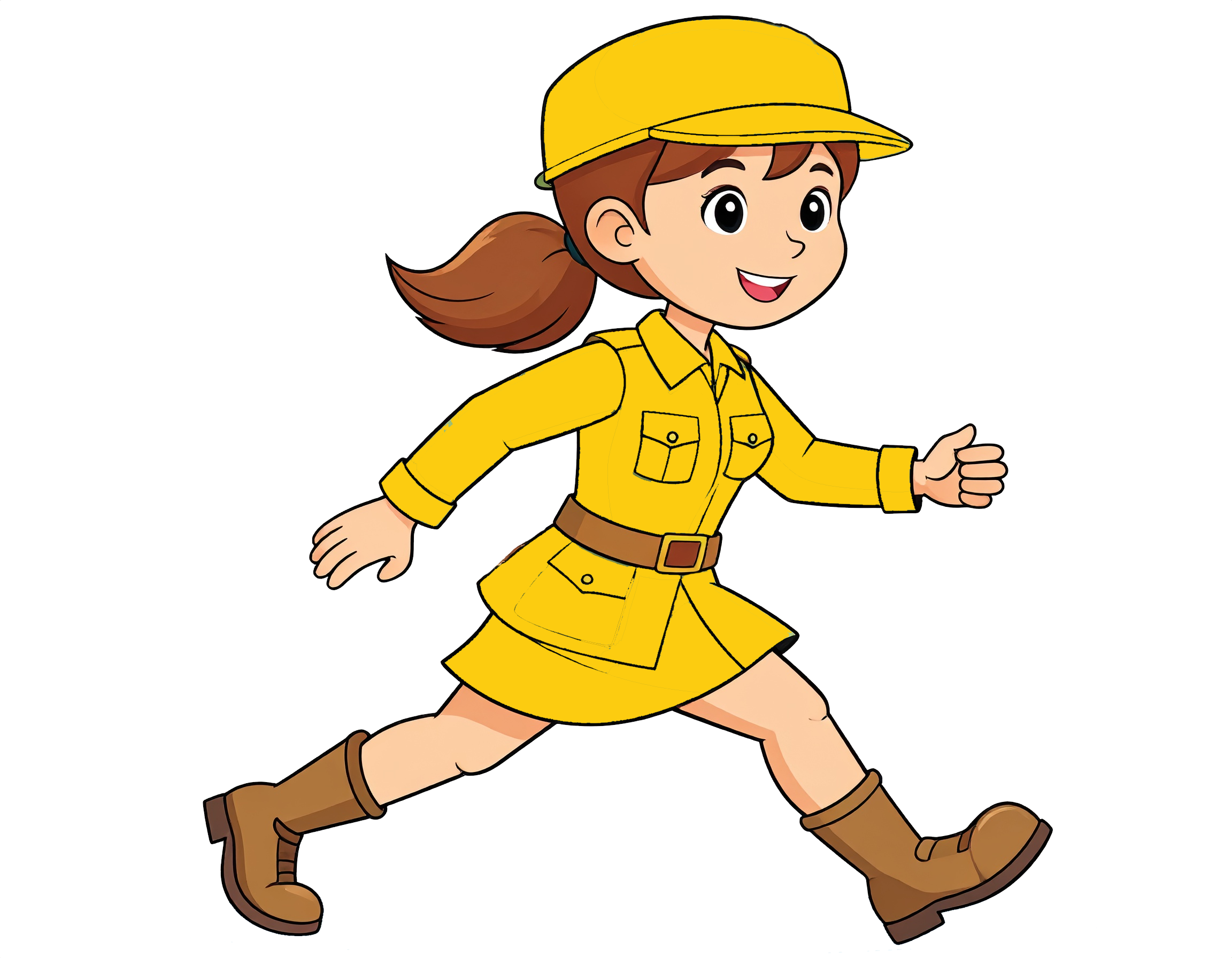
2. Marching Person
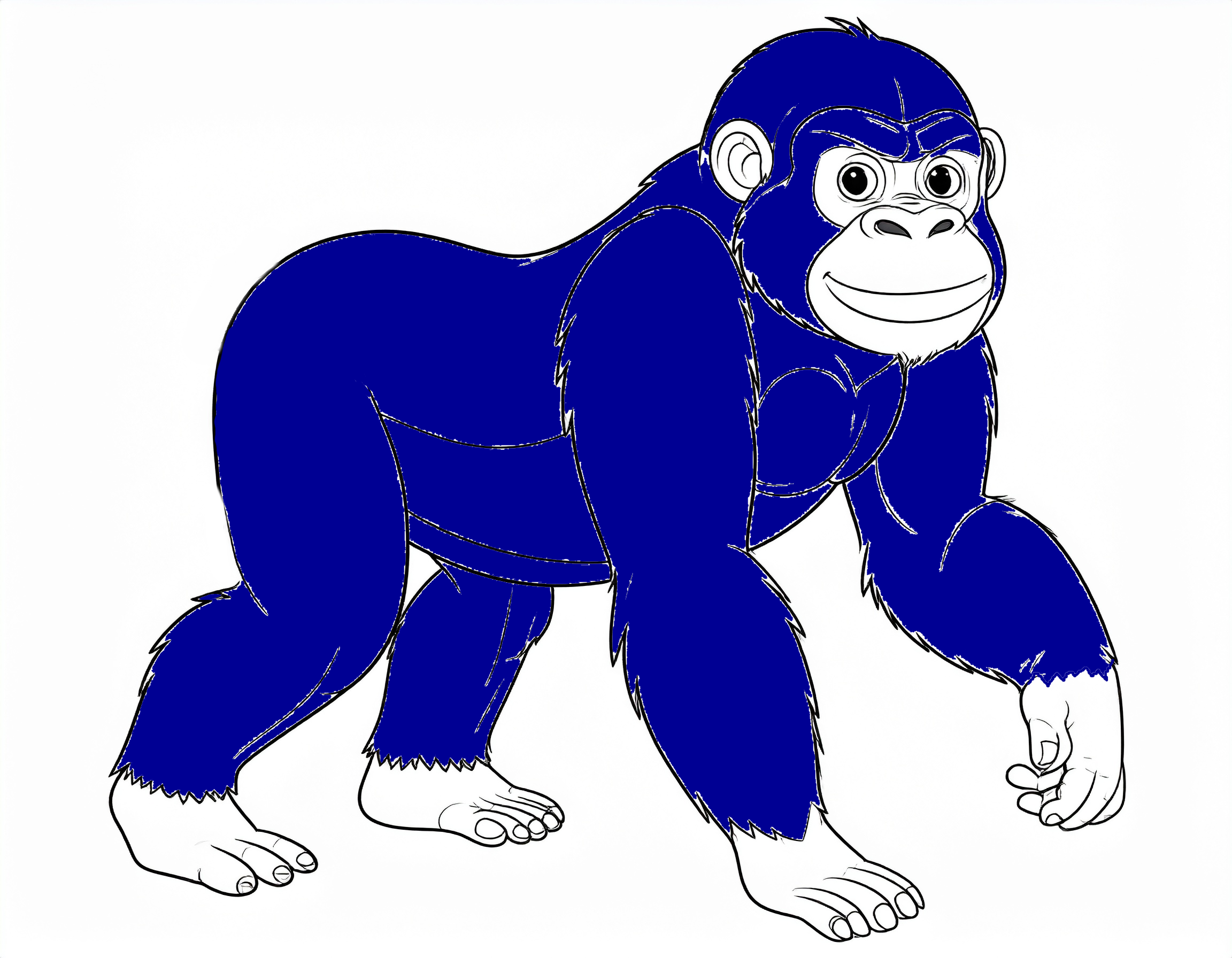
2. Ape (sounds like April)
5. Mail (May visualised as an envelope for someone's mail.)

6. jug (sounds like June)

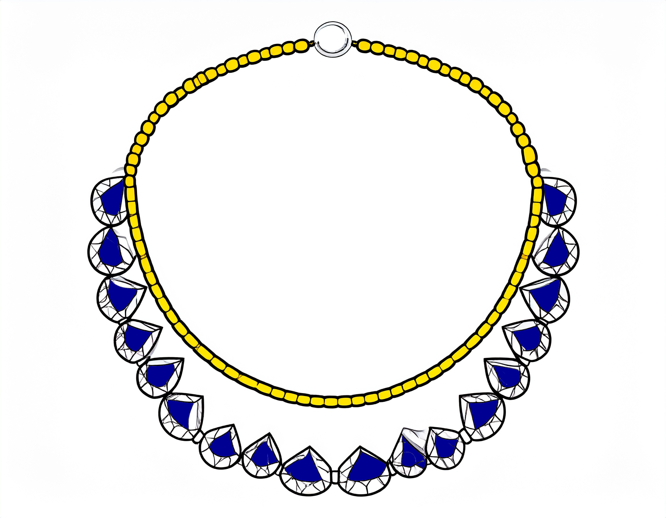
7. Jewel necklace
8. Organ musical instrument (sounds like August.)

9. Separate (a magnet separates from another magnet)

10. Octopus

11. New ribbon bow
12. December decoration.

Colour Fill
I experimented with using stroke fills like white diagonal strokes across a red colour. If the strokes are close together then the overall appearance is of an off-red colour rather than a memorable stroke fill.
I can see a potential use of more spread out strokes to help distinguish some colours from others. I have trouble with two colours that look like types of dark grey: colours 18 and 20. So it might be good if I had a rule that colour 20 also needs diagonal strokes through it in a picture.
Colours 02 and 13 are both yellows. So give Colour 13 black horizontal stipes across the light yellow background.

Colour 11 could have stroke fills to distinguish it a brown and from the main orange; so colour 11 could use white diagonal strokes.

Colour 12 could have a diagonal white stroke fill.
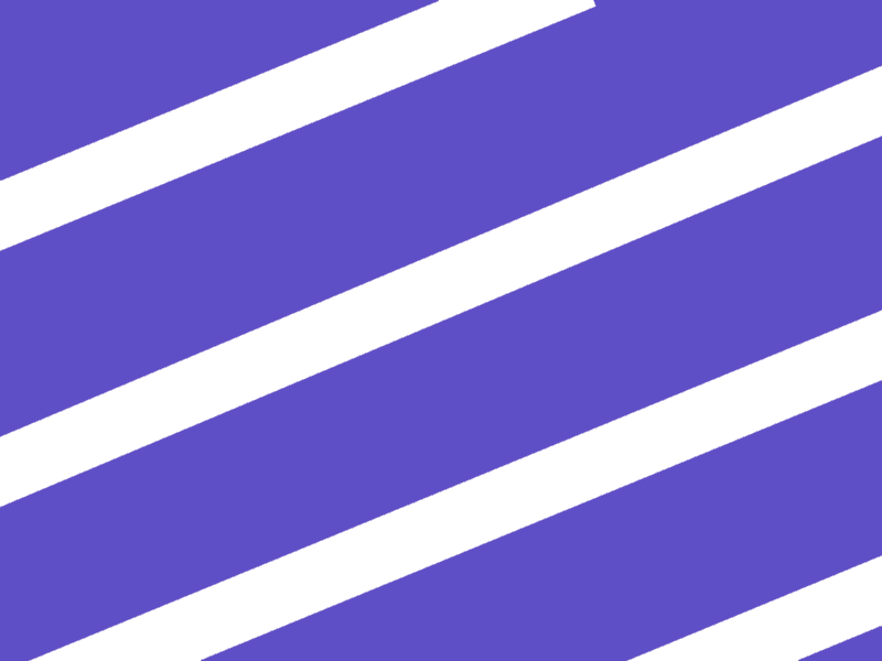
Colour 18 could have a diagonal white stroke fill.

Those texture fills could be handy in situations where the surface area of the colour fill is quite small. With the Actions article, an action by a person can mean a spelling prompt; someone might whip an object and the whip action means a spelling prompt but the colour fill of the whip can spell something too: an action usually implies 2 letters such as 'BA' and colour fill of the action could imply 'C' to give 'BAC' spelling prompt. If the added letter needed to be 'T' [colour 18] then the white stripe effect could be imagined in the grey whip colour so that I have certainty that it is 'T' rather than the similar grey used for 'L'.
Note: If I intend the action to really mean just two letters and no interpretation of a third letter then the colour fill can be colour 27 - the 'Q' colour - that is because 'Q' is so rare in English that I can use it for this separate purpose.
You don't need to use all 28 colours: the Double Digit Acrostics article lists about half that number of colours which suffice as prompts in most situations.
The bigger the area of colour fill, the easier it is to distinguish the colours, in my opinion. I think that outfit colour fill can be plain colours without embellishment: the surface area is big enough to make the impression of the colour stronger without needing stripe pattern fills to assist.
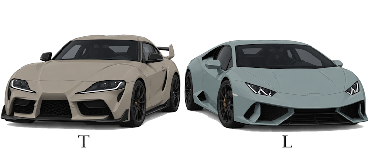
I found some colours hard to imagine when I take my eyes away from the colour chart; making a drawing that uses both close colours is an exercise I am trying in order to improve my visualisation skills:
Why do some colours represent more than one spelling?
In the colour chart, red represents the number 9 and it represents V and also ZH (the sound in 'pleasure' that sounds a bit like 'j'). There is a murky green which represents the number 22 but also the spelling "H" and the spellig "TH"; why allow that vagueness about how to interpret a colour?. It is because I ran out of distinctly different colours; even the list of 28 has its problems if surface area is small.
Maybe practice makes perfect: maybe, in the same way that I distinguish the two yellows well nowadays, maybe the 3 browns will become significantly easier for me to distinguish, in time. The tricky aspect is that I need to be able to recall a colour well enough to distinguish its shade from the other shades; that is harder than starting off with seeing the correct colour on a computer screen or page because the colour presentation has been done for me.
The Grey 18 (= "T") reminds me of a threatening thunder storm sky. The Grey 8 (="Y") is like an overcast grey day. Grey 20 (="L") reminds me more of manmade material colour - like a shade of metal with maybe a hint of blue in it. Maybe it would be the colour of a bolt or the colour of a building block.
Brown 6 is a lot darker than the other two browns; so I am most hopeful of distinguishing that one; it reminds me of a hot chocolate drink. Brown 11 ("J") reminds me of a jam gel put on cakes or biscuits; or it reminds me of a shade which artists use when drawing autumn. Brown 21 ("CH") is a bit like a colour I see in olives.

Here is a variety of honey mustard that is close to brown 21:

Hexadecimal codes for the colours
| Color Swatch Hex Codes | |
| Index | Approximate Hex Code |
| 0 | 000000 |
| 1 | F88017 |
| 2 | FCCC10 |
| 3 | 42B62A |
| 4 | FF00C6 |
| 5 | 000093 |
| 6 | 974724 |
| 7 | F5C3C6 |
| 8 | E6E2E2 |
| 9 | FF0209 |
| 10 | FFFFFF |
| 11 | C67429 |
| 12 | 5F4FC7 |
| 13 | FFFF43 |
| 14 | F9DBA5 |
| 15 | 00FFFF |
| 16 | 601B84 |
| 17 | 0091C7 |
| 18 | A9A193 |
| 19 | DC3874 |
| 20 | 90A2A2 |
| 21 | 9D7233 |
| 22 | 757500 |
| 23 | ADE7A2 |
| 24 | CCDF28 |
| 25 | 9B30FF |
| 26 | FE7D68 |
| 27 | 87CEFA |
But if I am just using colours 01 to 10 in a piece of work then exact shades of grey or exact shades of blue are not crucial; and that lets me use a gray that is more non-white than colour 08 is; and blue 05 needn't be so dark. So sometimes I do break away from the strict hex colour approach.
And when I use colours 00 to 19 to colour fill hair, I am aiming to distinguish brown 11 from brown 06 by adding waves of gray to the brown 11 version of each hairstyle. Yellow 13 can have grey hair waves added to distinguish that yellow from yellow 02 and colour 12 can have waves of grey added to it in hair colour fill in order to distinguish it easily from colours 05 and 17. And light grey 08 is quite close to white 10; so I am adding grey waves to the whitish grey 08 hairstyle
Despite that use of gray waves, I have not used them on the 1000 cartoon women because simple hair colour fills were all I had when I focused on them.
Colour Varies Between Devices
If a colour looks wrong to me, sometimes, it can be because the colour looks fine on my laptp but looks a bit different on my mobile phone.